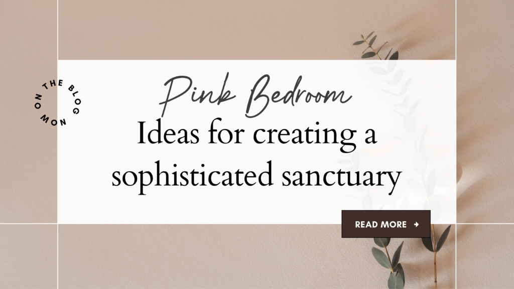
Pink Bedroom Ideas: Creating a Sophisticated Sanctuary
Discover how dusty rose tones and velvet textures transform a bedroom into a space of quiet luxury and romantic calm
Affiliate Disclosure: This article contains affiliate links to products on Amazon. When you make a purchase through these links, Quiet Home Decor may earn a small commission at no additional cost to you. We only recommend products we believe align with our standards for quality and design. Thank you for supporting our work.

The transformation of pink from a predictable palette choice to a sophisticated design statement represents one of the most compelling evolutions in contemporary interior design. When executed with intention and restraint, dusty rose and mauve tones create an atmosphere of serene luxury that few other color families can achieve.
This is not about decorating with pink—it is about understanding how muted rose tones, when layered with complementary neutrals and tactile materials, create spaces that feel both grounding and aspirational. The bedroom featured here demonstrates this principle perfectly: a careful balance of warm cream, soft grey, and various shades of pink creates depth without overwhelming the senses.
What makes this aesthetic particularly compelling is its foundation in texture rather than color saturation. Velvet bedding catches light differently throughout the day, creating subtle shifts in tone. Linen curtains soften harsh sunlight. A plush area rug anchors the space with visual weight. These are the details that separate a well-designed room from one that simply contains beautiful objects.
The Foundation: Understanding the Palette
The success of this bedroom aesthetic rests on a carefully calibrated color relationship. Unlike more saturated pink schemes, this approach relies on dusty rose and mauve—colors that sit comfortably between pink and beige, warm enough to feel inviting yet sophisticated enough for adult spaces.
The psychological impact of these tones has been well-documented. Soft pink reduces stress and creates a sense of calm, making it particularly appropriate for bedrooms. Yet the key lies in how these colors are deployed: as part of a larger neutral scheme rather than as the dominant force.
The formula is straightforward: sixty percent of the room in warm neutral tones (cream walls, light wood flooring), thirty percent in your primary color (pink bedding, headboard), and ten percent in accent colors (bronze hardware, botanical prints, touches of sage green from living plants). This creates visual balance while preventing any single element from dominating.
Temperature Matters
All colors in this scheme lean warm. Even the grey rug should have subtle warm undertones rather than cool, blue-based tones. This temperature harmony is what allows such varied elements to feel cohesive rather than chaotic. When selecting paint, fabric, or furnishings, hold samples together in natural light to ensure they share this warm foundation.
The Complete Look: Essential Elements
Each piece has been selected for its contribution to the overall aesthetic—quality materials, appropriate scale, and enduring design that will remain relevant beyond seasonal trends. All products are available on Amazon for convenient purchasing and reliable delivery.
| Product | Price | |
|---|---|---|
|
Modway Athena Performance Velvet Headboard
Full/Queen size in Dusty Rose. The foundation piece that anchors the entire design with its curved silhouette and performance velvet upholstery.
|
$146.95 | Shop Now |
|
BEDELITE Velvet Quilt Set
King size in Dusty Pink. Luxury velvet comforter with quilted texture, includes matching pillow shams for a cohesive layered look.
|
$88.39 | Shop Now |
|
Premium Blush Pink Bedding Set
Coordinating sheets and pillowcases in soft blush for layering beneath the velvet quilt. Essential for creating depth in your bedding ensemble.
|
$79.99 | Shop Now |
|
White Nightstand with Drawers
Crisp white finish provides necessary contrast to the pink tones while offering functional storage to maintain the room’s serene aesthetic.
|
$56.99 | Shop Now |
|
Luxury Pink Velvet Throw Pillows
Set of coordinating velvet pillows for additional texture and comfort. Layer in varying shades of pink for dimensional interest.
|
$45.99 | Shop Now |
|
KAIRNE Botanical Wall Art Set
Set of three vintage tree sketches (16″x24″ each) in neutral tones. Brings organic elements into the space without competing with the color scheme.
|
$94.99 | Shop Now |
|
Floralux Plush Area Rug
8′ x 10′ in soft grey. Provides essential grounding for the space with its substantial size and plush texture that feels luxurious underfoot.
|
$54.88 | Shop Now |
| Total Investment: | $568.18 | |
The Art of Layering: Creating Depth and Interest
The difference between a room that looks decorated and one that feels truly designed often comes down to layering. This applies to color, texture, and even light.
Textural Layering
Begin with your foundation layer: fitted sheets in soft cotton or linen. Add the velvet quilt as your primary visual element—this is where the eye will naturally land, so quality matters here. Layer pillows in graduating sizes, mixing velvet with linen or cotton to prevent textural monotony. A lightweight throw in a complementary neutral (cream, soft grey) should be draped rather than neatly folded, suggesting comfort rather than formality.
The key is variation within a cohesive palette. Your velvet headboard provides one texture, the quilted bedding another, linen curtains yet another. Each catches light differently, creating visual interest throughout the day as natural light shifts.
The Role of Natural Materials
Introduce organic elements to prevent the space from feeling too precious or overly designed. A simple ceramic vase with eucalyptus branches, a wooden tray on the nightstand, linen curtains—these natural materials ground the softer, more romantic elements and add necessary weight to the composition.
Lighting Considerations
Lighting transforms how pink tones are perceived. Warm-toned bulbs (2700K) enhance the rosy qualities while maintaining sophistication. Cool white light will make dusty pink appear washed out and institutional rather than inviting.
Layer your lighting just as you layer your textiles: overhead lighting for general illumination, bedside lamps for reading and ambiance, perhaps small accent lights to highlight artwork or architectural details. Dimmer switches are essential—they allow you to adjust the room’s mood from bright and energizing in the morning to soft and restful in the evening.
Essential Design Principles
- Scale and Proportion Ensure your nightstands are roughly the same height as your mattress top. Artwork should be hung so the center point sits at eye level, typically 57-60 inches from the floor. Your area rug should extend at least 18-24 inches beyond the sides of your bed.
- The Power of Asymmetry Avoid styling nightstands identically. Varying heights in lamps and decor creates visual interest that feels organic rather than staged. One side might feature a taller lamp with a small plant, the other a shorter lamp with stacked books.
- Negative Space Resist the urge to fill every surface. The room should feel curated rather than cluttered. Each object should earn its place through beauty, function, or both.
- Quality Over Quantity Better to have fewer pieces of higher quality than many lesser items. This applies to everything from bedding to artwork to accent pieces.
The most successful rooms are not those that follow trends, but those that create environments perfectly calibrated to the needs and sensibilities of the people who inhabit them.
Architectural Considerations and Window Treatments
Your room’s architecture provides the framework within which all other design decisions sit. Work with, not against, these structural elements.
Wall Color and Treatment
For rooms with generous natural light, warm cream or soft white walls (consider Benjamin Moore’s Cloud White or Swiss Coffee) provide the ideal backdrop. These allow your pink elements to appear as intentional accents rather than overwhelming the space.
If considering an accent wall, place it behind the headboard and keep the treatment subtle—perhaps a textured wallpaper in a barely-there blush rather than a bold color. The goal is depth, not drama.
Window Treatments
Curtains should be floor-length and hung as close to the ceiling as possible to create the illusion of height. For this aesthetic, choose either soft grey linen or warm cream cotton in a heavyweight fabric that drapes well. Avoid pink curtains—they will make the room feel overwhelmingly monochromatic and dated.
Allow curtains to puddle slightly on the floor (an extra 2-3 inches of length) for a luxurious look, or have them just kiss the floor for a more tailored appearance. Both work; the choice depends on your overall aesthetic preference.
Hardware as Jewelry
Curtain rods, drawer pulls, picture frames—these small details function like jewelry in fashion. Warm bronze or brushed brass finishes add sophisticated polish without competing for attention. Avoid mixing metal finishes; choose one and apply it consistently throughout the space.
Storage Without Sacrifice
Even in a carefully designed bedroom, practical storage remains essential. The challenge is integrating it seamlessly into your aesthetic.
The white nightstands provide drawer storage for items you want close at hand but out of sight. Add a decorative tray to the surface to corral items you use daily—reading glasses, hand cream, a small carafe of water. This contains visual clutter while maintaining easy access.
Consider a upholstered storage bench at the foot of the bed in a complementary fabric. This provides both seating and hidden storage for extra blankets or out-of-season clothing. Woven baskets beneath the nightstand’s lower shelf offer additional storage that reads as intentional design rather than afterthought organization.
In the closet, invest in matching hangers (slim velvet hangers in blush maintain the aesthetic even in hidden spaces) and use uniform storage boxes on upper shelves. The less time you spend managing visual chaos, the more you can enjoy the calm your bedroom provides.
Seasonal Adaptation
While this room’s foundation remains constant, small seasonal adjustments keep it feeling fresh and responsive to changing light and temperature.
In spring and summer, swap heavier velvet throw pillows for lighter linen versions in cream or soft grey. Replace thick knit throws with lightweight cotton or gauze. Fresh flowers in simple vessels bring living color without permanent commitment.
As temperatures drop in fall and winter, layer in richer textures: deeper berry-toned accent pillows, heavier wool or cashmere throws, perhaps dried florals or branches in your vases. These subtle shifts acknowledge the changing seasons while maintaining your room’s essential character.
Beyond Aesthetics: Creating Sanctuary
The ultimate goal transcends visual appeal. This bedroom should function as genuine sanctuary—a space that signals to your nervous system that you are safe, that you can rest, that beauty and comfort are not luxuries but necessities.
Consider engaging all senses, not just sight. The tactile pleasure of velvet bedding, the subtle scent of lavender or rose from a quality diffuser, the sound quality of a white noise machine or carefully chosen music, the taste of water from a bedside carafe. Each of these elements contributes to the room’s ability to serve its primary function: facilitating genuine rest and restoration.
This attention to sensory experience transforms a well-decorated room into a truly restful environment. It is the difference between a space that looks beautiful in photographs and one that supports your actual life.
The Practice of Maintenance
A well-designed room requires consistent, gentle maintenance. Make your bed daily—this single act has disproportionate impact on how the entire space feels. Refresh your bedding weekly, rotate pillows to maintain their shape, dust surfaces regularly. These small practices preserve both the room’s appearance and the sense of care it represents.
Final Considerations
The bedroom presented here offers a template, not a prescription. Your own space will have unique dimensions, light quality, and architectural features that require adaptation. The principles remain constant: careful attention to color temperature, thoughtful layering of texture, quality materials chosen for longevity rather than trend, and consistent consideration of how the space serves your actual needs.
This is not about creating a room that looks like this room. It is about understanding the decisions that make this room successful, then applying those principles to your own space with materials and objects that resonate with your particular sensibility.
The most successful interiors are never finished—they evolve gradually as you live in them, discover what works, and refine what doesn’t. Allow yourself this process. Trust that attention, care, and time will create something far more valuable than any perfectly staged photograph: a room that genuinely supports the life you want to live.